In the last chapter, our browser created a graphical window and drew a grid of characters to it. That’s OK for Chinese, but English text features characters of different widths grouped into words that you can’t break across lines.There are lots of languages in the world, and lots of typographic conventions. A real web browser supports every language from Arabic to Zulu, but this book focuses on English. Text is near-infinitely complex, but this book cannot be infinitely long! In this chapter, we’ll add those capabilities. You’ll even be able to read this chapter in your browser!
So far, we’ve called create_text with a character and
two coordinates to write text to the screen. But we never specified its
font, size, or style. To talk about those things, we need to create and
use font objects.
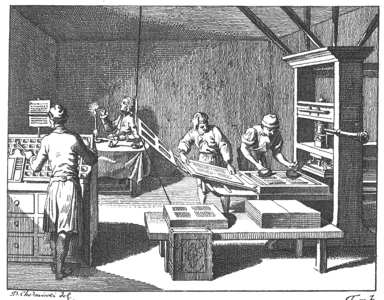
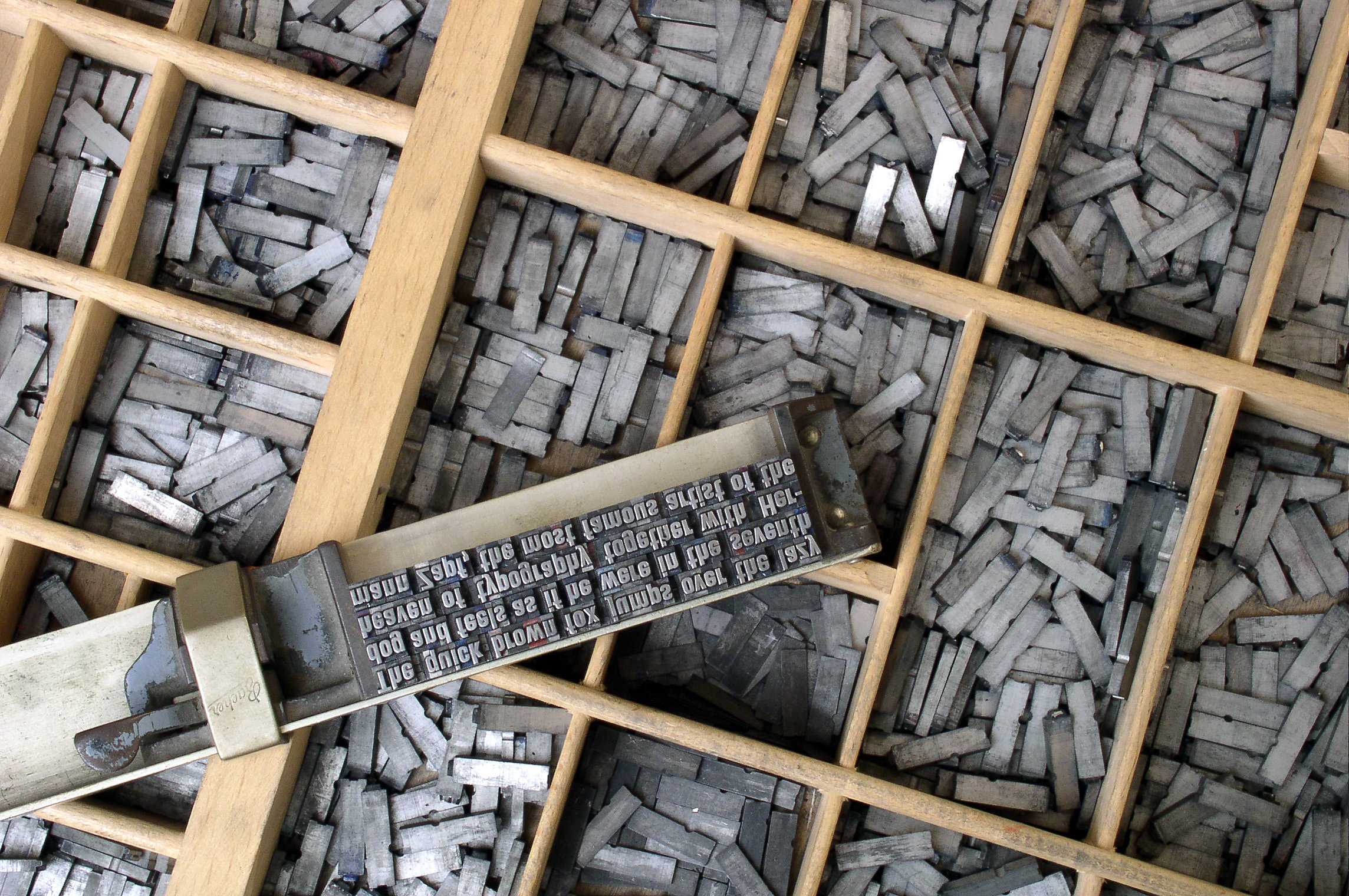
What is a font, exactly? Well, in the olden days, printers arranged little metal slugs on rails, covered them with ink, and pressed them to a sheet of paper, creating a printed page (see Figure 1). The metal shapes came in boxes, one per letter, so you’d have a (large) box of e’s, a (small) box of x’s, and so on. The boxes came in cases (see Figure 2), one for upper-case and one for lower-case letters. The set of cases was called a font.The word is related to foundry, which would create the little metal shapes. Naturally, if you wanted to print larger text, you needed different (bigger) shapes, so those were a different font; a collection of fonts was called a type, which is why we call it typing. Variations—like bold or italic letters—were called that type’s “faces”.
This nomenclature reflects the world of the printing press: metal shapes in boxes in cases from different foundries. Our modern world instead has dropdown menus, and the old words no longer match it. “Font” can now mean font, typeface, or type,Let alone “font family”, which can refer to larger or smaller collections of types. and we say a font contains several different weights (like “bold” and “normal”),But sometimes other weights as well, like “light”, “semibold”, “black”, and “condensed”. Good fonts tend to come in many weights. several different styles (like “italic” and “roman”, which is what not-italic is called),Sometimes there are other options as well, like maybe there’s a small-caps version; these are sometimes called options as well. And don’t get me started on automatic versus manual italics. and arbitrary sizes.A font looks especially good at certain sizes where hints tell the computer how best to align it to the pixel grid. Welcome to the world of magic ink.This term comes from an essay by Bret Victor that discusses how the graphical possibilities of computers can make for better and easier-to-use applications.
Yet Tk’s font objects correspond to the older meaning of
font: a type at a fixed size, style, and weight. For example:You can only create
Font objects, or any other kinds of Tk objects, after
calling tkinter.Tk(), and you need to import
tkinter.font separately.
import tkinter.font
window = tkinter.Tk()
bi_times = tkinter.font.Font(
    family="Times",
    size=16,
    weight="bold",
    slant="italic",
)
Your computer might not have “Times” installed; you can list the
available fonts with tkinter.font.families() and pick
something else.
Font objects can be passed to create_text’s
font argument:
canvas.create_text(200, 100, text="Hi!", font=bi_times)In the olden times, American typesetters kept their boxes of metal shapes arranged in a California job case, which combined lower- and upper-case letters side by side in one case, making typesetting easier. The upper-/lower-case nomenclature dates from centuries earlier.
Text takes up space vertically and horizontally, and the font
object’s metrics and measure methods measure
that space:On your
computer, you might get different numbers. That’s right—text rendering
is OS-dependent, because it is complex enough that everyone uses one of
a few libraries to do it, usually libraries that ship with the OS.
That’s why macOS fonts tend to be “blurrier” than the same font on
Windows: different libraries make different
trade-offs.
>>> bi_times.metrics()
{'ascent': 15, 'descent': 4, 'linespace': 19, 'fixed': 0}
>>> bi_times.measure("Hi!")
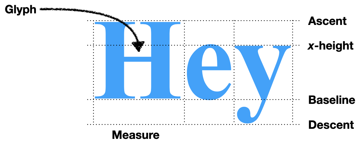
24The metrics call yields information about the vertical
dimensions of the text (see Figure 3): the linespace is how
tall the text is, which includes an ascent which goes
“above the line” and a descent that goes “below the
line”.The
fixed parameter is actually a boolean and tells you whether
all letters are the same width, so it doesn’t really fit
here. The ascent and descent
matter when words in different sizes sit on the same line: they ought to
line up “along the line”, not along their tops or bottoms.
Let’s dig deeper. Remember that bi_times is size-16
Times: why does font.metrics report that it is actually 19
pixels tall? Well, first of all, a size of 16 means 16 points,
which are defined as 72nds of an inch, not 16 pixels,Actually, the definition of a
“point” is a total mess, with many different length units all called
“point” around the world. The Wikipedia
page has the details, but a traditional American/British point is
actually slightly less than 1/72 of an inch. The 1/72 standard comes
from PostScript, but some systems predate it; TeX , for example, hews
closer to the traditional point, approximating it as 1/72.27 of an
inch. which your monitor probably has around 100 of per
inch.Tk doesn’t use
points anywhere else in its API. It’s supposed to use pixels if you pass
it a negative number, but that doesn’t appear to work.
Those 16 points measure not the individual letters but the metal blocks
the letters were once carved from, so the letters themselves must be
less than 16 points. In fact, different size-16 fonts have
letters of varying heights:You might even notice that Times has different metrics in
this code block than in the earlier one where we specified a bold,
italic Times font. The bold, italic Times font is taller, at least on my
current macOS system!
>>> tkinter.font.Font(family="Courier", size=16).metrics()
{'fixed': 1, 'ascent': 13, 'descent': 4, 'linespace': 17}
>>> tkinter.font.Font(family="Times", size=16).metrics()
{'fixed': 0, 'ascent': 14, 'descent': 4, 'linespace': 18}
>>> tkinter.font.Font(family="Helvetica", size=16).metrics()
{'fixed': 0, 'ascent': 15, 'descent': 4, 'linespace': 19}
The measure() method is more direct: it tells you how
much horizontal space text takes up, in pixels. This depends on
the text, of course, since different letters have different widths:Note that the sum of the
individual letters’ lengths is not the length of the word. Tk uses
fractional pixels internally, but rounds up to return whole pixels in
the measure call. Plus, some fonts use something called
kerning to shift letters a little bit when particular pairs of
letters are next to one another, or even shaping to make two
letters look one glyph.
>>> bi_times.measure("Hi!")
24
>>> bi_times.measure("H")
13
>>> bi_times.measure("i")
5
>>> bi_times.measure("!")
7
>>> 13 + 5 + 7
25
You can use this information to lay text out on the page. For example, suppose you want to draw the text “Hello, world!” in two pieces, so that “world!” is italic. Let’s use two fonts:
font1 = tkinter.font.Font(family="Times", size=16)
font2 = tkinter.font.Font(family="Times", size=16, slant='italic')
We can now lay out the text, starting at (200, 200):
x, y = 200, 200
canvas.create_text(x, y, text="Hello, ", font=font1)
x += font1.measure("Hello, ")
canvas.create_text(x, y, text="world!", font=font2)
You should see “Hello,” and “world!”, correctly aligned and with the second word italicized.
Unfortunately, this code has a bug, though one masked by the choice
of example text: replace “world!” with “overlapping!” and the two words
will overlap. That’s because the coordinates x and
y that you pass to create_text tell Tk where
to put the center of the text. It only worked for “Hello,
world!” because “Hello,” and “world!” are the same length!
Luckily, the meaning of the coordinate you pass in is configurable.
We can instruct Tk to treat the coordinate we gave as the top-left
corner of the text by setting the anchor argument to
"nw", meaning the “northwest” corner of the text:
x, y = 200, 225
canvas.create_text(x, y, text="Hello, ", font=font1, anchor='nw')
x += font1.measure("Hello, ")
canvas.create_text(
    x, y, text="overlapping!", font=font2, anchor='nw')
Modify the draw function to set anchor to
"nw"; we didn’t need to do that in the previous chapter
because all Chinese characters are the same width.
If you find font metrics confusing, you’re not the only one! In 2012, the Michigan Supreme Court heard Stand Up for Democracy v. Secretary of State, a case ultimately about a ballot referendum’s validity that centered on the definition of font size. The court decided (correctly) that font size is the size of the metal blocks that letters were carved from and not the size of the letters themselves.
In Chapter 2, the layout
function looped over the text character by character and moved to the
next line whenever we ran out of space. That’s appropriate in Chinese,
where each character more or less is a word. But in English you
can’t move to the next line in the middle of a word. Instead, we need to
lay out the text one word at a time:This code splits words on whitespace. It’ll thus break on
Chinese, since there won’t be whitespace between words. Real browsers
use language-dependent rules for laying out text, including for
identifying word boundaries.
def layout(text):
    # ...
    for word in text.split():
        # ...
    return display_list
Unlike Chinese characters, words are different sizes, so we need to measure the width of each word:
import tkinter.font

def layout(text):
    font = tkinter.font.Font()
    # ...
    for word in text.split():
        w = font.measure(word)
    # ...
Here I’ve chosen to use Tk’s default font. Now, if we draw the text
at cursor_x, its right end would be at
cursor_x + w. That might be past the right edge of the
page, and in this case we need to make space by wrapping to the next
line:
def layout(text):
    for word in text.split():
        # ...
        if cursor_x + w > WIDTH - HSTEP:
            cursor_y += font.metrics("linespace") * 1.25
            cursor_x = HSTEP
Note that this code block only shows the insides of the
for loop. The rest of layout should be left
alone. Also, I call metrics with an argument; that just
returns the named metric directly. Finally, note that I multiply the
linespace by 1.25 when incrementing y. Try removing the
multiplier: you’ll see that the text is harder to read because the lines
are too close together.Designers say the text is too “tight”.
Instead, it is common to add “line spacing” or “leading”So named because in metal type
days, thin pieces of lead were placed between the lines to space them
out. Lead is a softer metal than what the actual letter pieces were made
of, so it could compress a little to keep pressure on the other pieces.
Pronounce it “led-ing” not “leed-ing”. between lines. The
25% line spacing is a typical amount.
So now cursor_x and cursor_y have the
location to the start of the word, so we add to the display
list and update cursor_x to point to the end of the
word:
def layout(text):
    for word in text.split():
        # ...
        display_list.append((cursor_x, cursor_y, word))
        cursor_x += w + font.measure(" ")
I increment cursor_x by
w + font.measure(" ") instead of w because I
want to have spaces between the words: the call to split()
removed all of the whitespace, and this adds it back. I don’t add the
space to w in the if condition, though,
because you don’t need a space after the last word on a line.
Breaking lines in the middle of a word is called hyphenation, and can
be turned on via the hyphens
CSS property. The state of the art is the Knuth–Liang
hyphenation algorithm, which uses a dictionary of word fragments to
prioritize possible hyphenation points. At first, the CSS specification
was
incompatible with this algorithm, but the recent text-wrap-style
property fixed that.
Right now, all of the text on the page is drawn with one font. But
web pages sometimes specify that text should be bold or
italic using the <b> and
<i> tags. It’d be nice to support that, but right
now, the code resists this: the layout function only
receives the text of the page as input, and so has no idea where the
bold and italics tags are.
Let’s change lex to return a list of tokens,
where a token is either a Text object (for a run of
characters outside a tag) or a Tag object (for the contents
of a tag). You’ll need to write the Text and
Tag classes:If you’re familiar with Python, you might want to use the
dataclass library, which makes it easier to define these
sorts of utility classes.
class Text:
    def __init__(self, text):
        self.text = text

class Tag:
    def __init__(self, tag):
        self.tag = tag
lex must now gather text into Text and
Tag objects:If you’ve done some or all of the exercises in prior
chapters, your code will look different. Code snippets in the book
always assume you haven’t done the exercises, so you’ll need to port
your modifications.
def lex(body):
    out = []
    buffer = ""
    in_tag = False
    for c in body:
        if c == "<":
            in_tag = True
            if buffer: out.append(Text(buffer))
            buffer = ""
        elif c == ">":
            in_tag = False
            out.append(Tag(buffer))
            buffer = ""
        else:
            buffer += c
    if not in_tag and buffer:
        out.append(Text(buffer))
    return out
Here I’ve renamed the text variable to
buffer, since it now stores either text or tag contents
before they can be used. The name also reminds us that, at the end of
the loop, we need to check whether there’s buffered text and what we
should do with it. Here, lex dumps any accumulated text as
a Text object. This way, even if it never sees an angle
bracket, it’ll still return a text token. But unfinished tags, like in
Hi!<hr, are thrown out.This may strike you as an odd
decision: why not finish up the tag for the author? I don’t know, but
dropping the tag is what browsers do.
Note that Text and Tag are asymmetric:
lex avoids empty Text objects, but not empty
Tag objects. That’s because an empty Tag
object represents the HTML code <>, while an empty
Text object represents no content at all.
Since we’ve modified lex, we are now passing
layout not just the text of the page, but also the tags in
it. So layout must loop over tokens, not text:
def layout(tokens):
    # ...
    for tok in tokens:
        if isinstance(tok, Text):
            for word in tok.text.split():
                # ...
    # ...
layout can also examine tag tokens to change font when
directed by the page. Let’s start with support for weights and styles,
with two corresponding variables:
weight = "normal"
style = "roman"
Those variables must change when the bold and italics open and close tags are seen:
if isinstance(tok, Text):
    # ...
elif tok.tag == "i":
    style = "italic"
elif tok.tag == "/i":
    style = "roman"
elif tok.tag == "b":
    weight = "bold"
elif tok.tag == "/b":
    weight = "normal"
Note that this code correctly handles not only
<b>bold</b> and
<i>italic</i> text, but also
<b><i>bold italic</i></b>
text.It even handles
incorrectly nested tags like
<b>b<i>bi</b>i</i>, but it does not
handle <b><b>twice</b>bolded</b>
text. We’ll return to this in Chapter
6.
The style and weight variables are used to
select the font:
if isinstance(tok, Text):
    for word in tok.text.split():
        font = tkinter.font.Font(
            size=16,
            weight=weight,
            slant=style,
        )
        # ...
Since the font is computed in layout but used in
draw, we’ll need to add the font used to each entry in the
display list:
if isinstance(tok, Text):
    for word in tok.text.split():
        # ...
        display_list.append((cursor_x, cursor_y, word, font))
Make sure to update draw to expect and use this extra
font field in display list entries.
Italic fonts were developed in Italy (hence the name) to mimic a cursive handwriting style called “chancery hand”. Non-italic fonts are called roman because they mimic text on Roman monuments. There is an obscure third option: oblique fonts, which look like roman fonts but are slanted.
With all of these tags, layout has become quite large,
with lots of local variables and some complicated control flow. That is
one sign that something deserves to be a class, not a function:
class Layout:
    def __init__(self, tokens):
        self.display_list = []
Every local variable in layout then becomes a field of
Layout:
self.cursor_x = HSTEP
self.cursor_y = VSTEP
self.weight = "normal"
self.style = "roman"
The core of the old layout is a loop over tokens, and we
can move the body of that loop to a method on Layout:
def __init__(self, tokens):
    # ...
    for tok in tokens:
        self.token(tok)

def token(self, tok):
    if isinstance(tok, Text):
        for word in tok.text.split():
            # ...
    elif tok.tag == "i":
        self.style = "italic"
    # ...
In fact, the body of the isinstance(tok, Text) branch
can be moved to its own method:
def word(self, word):
    font = tkinter.font.Font(
        size=16,
        weight=self.weight,
        slant=self.style,
    )
    w = font.measure(word)
    # ...
Now that everything has moved out of Browser’s old
layout function, it can be replaced with calls into
Layout:
class Browser:
    def load(self, url):
        body = url.request()
        tokens = lex(body)
        self.display_list = Layout(tokens).display_list
        self.draw()
When you do big refactors like this, it’s important to work incrementally. It might seem more efficient to change everything at once, but that efficiency brings with it a risk of failure: trying to do so much that you get confused and have to abandon the whole refactor. So take a moment to test that your browser still works before you move on.
Anyway, this refactor isolated all of the text-handling code into its
own method, with the main token function just branching on
the tag name. Let’s take advantage of the new, cleaner organization to
add more tags. With font weights and styles working, size is the next
frontier in typographic sophistication. One simple way to change font
size is the <small> tag and its deprecated sister tag
<big>.In your web design projects, use the CSS
font-size property to change text size instead of
<big> and <small>. But since we
haven’t yet implemented CSS for our browser (see Chapter 6), we’re stuck using tags
here.
Our experience with font styles and weights suggests a simple
approach that customizes the size field in
Layout. It starts out with:
self.size = 12That variable is used to create the font object:
font = tkinter.font.Font(
    size=self.size,
    weight=self.weight,
    slant=self.style,
)
And we can change the size in <big> and
<small> tags by updating this variable:
def token(self, tok):
    # ...
    elif tok.tag == "small":
        self.size -= 2
    elif tok.tag == "/small":
        self.size += 2
    elif tok.tag == "big":
        self.size += 4
    elif tok.tag == "/big":
        self.size -= 4
Try wrapping a whole paragraph in <small>, like
you would a bit of fine print, and enjoy your newfound typographical
freedom.
All of <b>, <i>,
<big>, and <small> date from an
earlier, pre-CSS era of the web. Nowadays, CSS can change how an element
appears, so visual tag names like <b> and
<small> are out of favor. That said,
<b>, <i>, and
<small> still have some appearance-independent
meanings.
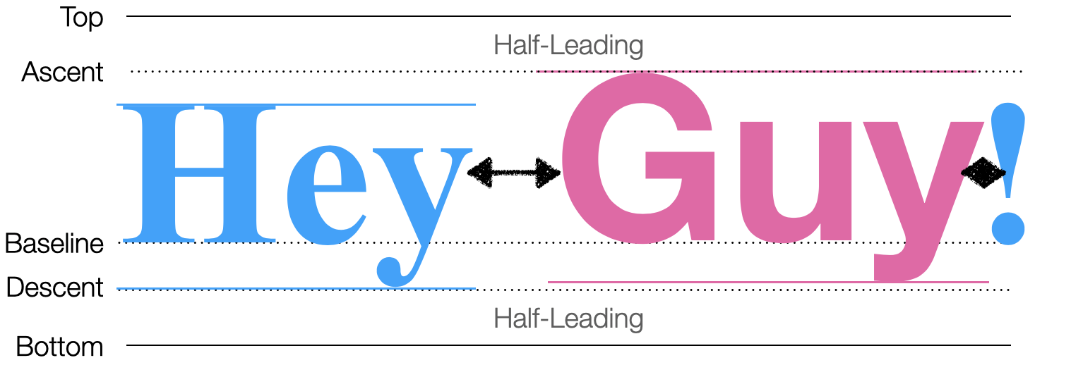
Start mixing font sizes, like
<small>a</small><big>A</big>, and
you’ll quickly notice a problem with the font size code: the text is
aligned along its top, as if it’s hanging from a clothes line. But you
know that English text is typically written with all letters aligned at
an invisible baseline instead.
Let’s think through how to fix this. If the bigger text is moved up,
it would overlap with the previous line, so the smaller text has to be
moved down. That means its vertical position has to be computed later,
after the big text passes through token. But since
the small text comes through the loop first, we need a two-pass
algorithm for lines of text: the first pass identifies what words go in
the line and computes their x positions, while the second pass
vertically aligns the words and computes their y positions (see
Figure 4).
Let’s start with phase one. Since one line contains text from many
tags, we need a field on Layout to store the line-to-be.
That field, line, will be a list, and text
will add words to it instead of to the display list. Entries in
line will have x but not y positions,
since y positions aren’t computed in the first phase:
class Layout:
    def __init__(self, tokens):
        # ...
        self.line = []
        # ...

    def word(self, word):
        # ...
        self.line.append((self.cursor_x, word, font))
The new line field is essentially a buffer, where words
are held temporarily before they can be placed. The second phase is that
buffer being flushed when we’re finished with a line:
class Layout:
    def word(self, word):
        if self.cursor_x + w > WIDTH - HSTEP:
            self.flush()
As usual with buffers, we also need to make sure the buffer is flushed once all tokens are processed:
class Layout:
    def __init__(self, tokens):
        # ...
        self.flush()
This new flush function has three responsibilities:
cursor_x and cursor_y
fields.Here’s what it looks like, step by step:

Since we want words to line up “on the line”, let’s start by computing where that line should be. That depends on the tallest word on the line:
def flush(self):
    if not self.line: return
    metrics = [font.metrics() for x, word, font in self.line]
    max_ascent = max([metric["ascent"] for metric in metrics])
The baseline is then max_ascent below
self.cursor_y—or actually a little more to account for the
leading:Actually, 25%
leading doesn’t add 25% of the ascent above the ascender and 25% of the
descent below the descender. Instead, it adds 12.5% of the line
height in both places, which is subtly different when fonts are
mixed. But let’s skip that subtlety here.
baseline = self.cursor_y + 1.25 * max_ascentNow that we know where the line is, we can place each word relative to that line and add it to the display list:
for x, word, font in self.line:
    y = baseline - font.metrics("ascent")
    self.display_list.append((x, y, word, font))
Note how y starts at the baseline, and moves up
by just enough to accommodate that word’s ascent. Now
cursor_y must move far enough down below
baseline to account for the deepest descender:
max_descent = max([metric["descent"] for metric in metrics])
self.cursor_y = baseline + 1.25 * max_descent
Finally, flush must update the Layout’s
cursor_x and line fields:
self.cursor_x = HSTEP
self.line = []
Now all the text is aligned along the line, even when text sizes are
mixed. Plus, this new flush function is convenient for
other line-breaking jobs. For example, in HTML the
<br> tagWhich is a self-closing tag, so there’s no
</br>. Many tags that are content, instead
of annotating it, are like this. Some people like adding a final slash
to self-closing tags, as in <br/>, but this is not
required in HTML. ends the current line and starts a new
one:
def token(self, tok):
    # ...
    elif tok.tag == "br":
        self.flush()
Likewise, paragraphs are defined by the <p> and
</p> tags, so </p> also ends the
current line:
def token(self, tok):
    # ...
    elif tok.tag == "/p":
        self.flush()
        self.cursor_y += VSTEP
I add a bit extra to cursor_y here to create a little
gap between paragraphs.
By this point you should be able to load up your browser and display an example page, which should look something like Figure 6.

Actually, browsers support not only horizontal but also vertical writing systems, like some traditional East Asian writing styles. A particular challenge is Mongolian script, which is written in lines running top to bottom, left to right. Many Mongolian government websites use the script.
Now that you’ve implemented styled text, you’ve probably
noticed—unless you’re on macOSWhile we can’t confirm this in the documentation, it seems
that the macOS “Core Text” APIs cache fonts more aggressively than Linux
and Windows. The optimization described in this section won’t hurt any
on macOS, but also won’t improve speed as much as on Windows and
Linux.—that on a large web page like this chapter our browser
has slowed significantly from the previous
chapter. That’s because text layout, and specifically the part where
you measure each word, is quite slow.You can profile Python programs by replacing your
python3 command with python3 -m cProfile. Look
for the lines corresponding to the measure and
metrics calls to see how much time is spent measuring
text.
Unfortunately, it’s hard to make text measurement much faster. With proportional fonts and complex font features like hinting and kerning, measuring text can require pretty complex computations. But on a large web page, some words likely appear a lot—for example, this chapter includes the word “the” over 200 times. Instead of measuring these words over and over again, we could measure them once, and then cache the results. On normal English text, this usually results in a substantial speedup.
Caching is such a good idea that most text libraries already
implement it, typically caching text measurements in each
Font object. But since our text method creates
a new Font object for each word, the caching is
ineffective. To make caching work, we need to reuse Font
objects when possible instead of making new ones.
We’ll store our cache in a global FONTS dictionary:
FONTS = {}The keys to this dictionary will be size/weight/style triples, and
the values will be Font objects.Actually, the values are a
font object and a tkinter.Label object. This dramatically
improves the performance of metrics for some reason, and is
recommended by the Python
documentation. We can put the caching logic itself in
a new get_font function:
def get_font(size, weight, style):
    key = (size, weight, style)
    if key not in FONTS:
        font = tkinter.font.Font(size=size, weight=weight,
            slant=style)
        label = tkinter.Label(font=font)
        FONTS[key] = (font, label)
    return FONTS[key][0]
Then the word method can call get_font
instead of creating a Font object directly:
class Layout:
    def word(self, word):
        font = get_font(self.size, self.weight, self.style)
        # ...
Now identical words will use identical fonts and text measurements will hit the cache.
Fonts for scripts like Chinese can be megabytes in size, so they are generally stored on disk and only loaded into memory on demand. That makes font loading slow and caching even more important. Browsers also have extensive caches for measuring, shaping, and rendering text. Because web pages have a lot of text, these caches turn out to be one of the most important parts of speeding up rendering.
The previous chapter introduced a browser that laid out characters in a grid. Now it does standard English text layout, so:
You can now use our browser to read an essay, a blog post, or even a book!
The complete set of functions, classes, and methods in our browser should look something like this:
class URL:
    def __init__(url)

    def request()
class Text:
    def __init__(text)
class Tag:
    def __init__(tag)
def lex(body)
FONTS
def get_font(size, weight, style)
WIDTH, HEIGHT
HSTEP, VSTEP
class Layout:
    def __init__(tokens)

    def token(tok)

    def flush()

    def word(word)
SCROLL_STEP
class Browser:
    def __init__()

    def draw()

    def load(url)

    def scrolldown(e)
3-1 Centered text. The page titles on this book’s website are
centered; make your browser do the same for text between
<h1 class="title"> and </h1>. Each
line has to be centered individually, because different lines will have
different lengths.In
early HTML there was a <center> tag that did exactly
this, but nowadays centering is typically done in CSS, through the
text-align property. The approach in this exercise is of
course non-standard, and just for learning purposes.
3-2 Superscripts. Add support for the
<sup> tag. Text in this tag should be smaller
(perhaps half the normal text size) and be placed so that the top of a
superscript lines up with the top of a normal letter.
3-3 Soft hyphens. The soft hyphen character, written
\N{soft hyphen} in Python, represents a place where the
text renderer can, but doesn’t have to, insert a hyphen and break the
word across lines. Add support for it.If you’ve done Exercise
1-4 on HTML entities, you might also want to add support for the
­ entity, which expands to a soft
hyphen. If a word doesn’t fit at the end of a line, check
if it has soft hyphens, and if so break the word across lines. Remember
that a word can have multiple soft hyphens in it, and make sure to draw
a hyphen when you break a word. The word
“supercalifragilisticexpialidocious” is a good test case.
3-4 Small caps. Make the <abbr> element
render text in small caps, like this. Inside an
<abbr> tag, lower-case letters should be small,
capitalized, and bold, while all other characters (upper case, numbers,
etc.) should be drawn in the normal font.
3-5 Preformatted text. Add support for the
<pre> tag. Unlike normal paragraphs, text inside
<pre> tags doesn’t automatically break lines, and
whitespace like spaces and newlines are preserved. Use a fixed-width
font like Courier New or SFMono as well. Make
sure tags work normally inside <pre> tags: it should
be possible to bold some text inside a <pre>. The
results will look best if you also do Exercise 1-4.
Did you find this chapter useful?